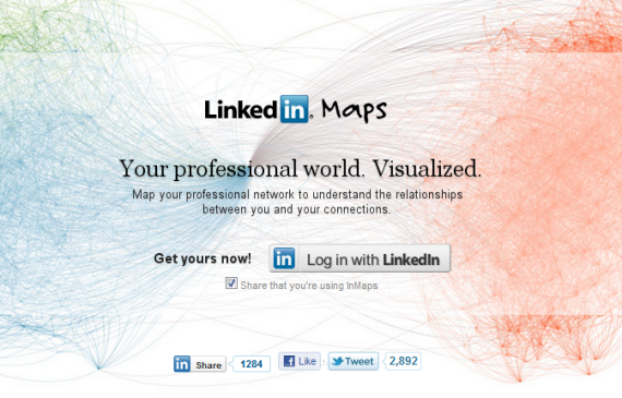
InMaps is an experimental project launched by LinkedIn. It creates a stunning visualization of the connections in your LinkedIn network.
InMap goes through all your connections, detects the relationships between them and groups them into different network clusters. InMap give different color-codes to each network cluster and groups them together so that you can see the depth of your connections.
Each of the connection in your network is displayed as a dot. People with bigger dots and their names in larger fonts have more connections in specific clusters. Although you can Zoon-in the map to view the names behind each dot.
You should have at least 50 connections and your profile needs to be 75% complete in order for InMap to work.
InMap also provides you with the sharing options. You can share your InMap graph with others via twitter, Facebook and LinkedIn.
Watch the following video to know more:
httpv://www.youtube.com/watch?v=PC99Nw2JX8w
Do let us know in your comments about what you think of InMaps?


